Last updated on : June 6th, 2022 by S Raange
A data visualization tool is software that converts raw data into easy-to-understand visuals, dashboards, or graphs. Looking at the charts, graphs, or other visual data forms, you find it easy to understand the key findings and get insights into what your business needs to thrive. Data visualization tools and solutions save you from dealing with the jumbles mess of numbers or boring data in your spreadsheets, helping you make smart and efficient marketing decisions.
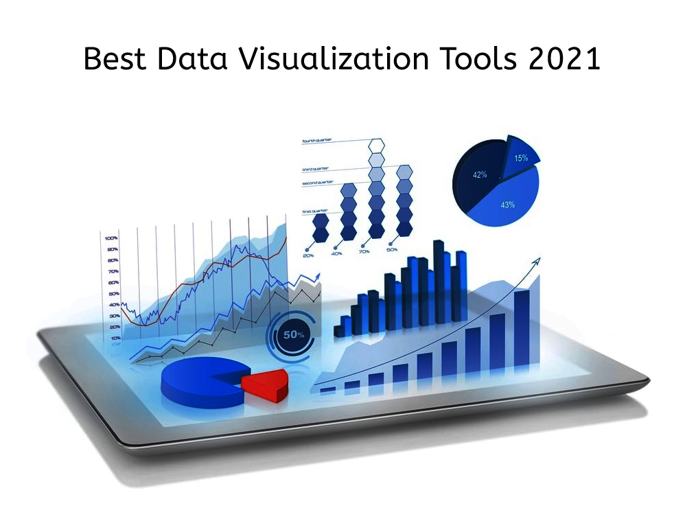
If you plan to implement data visualization for your business, below are the best data visualization tools & solutions to consider in 2021.
Google Charts is a wonderful data visualization tool that helps you create interactive charts. This tool runs on HTML5, and SVG and gives you complete control over the charts you create. It is pretty easy to use, and you don’t need any advanced technical knowledge to get started.
Whether it is a startup, mid-sized company, or a large enterprise, it is suitable for all types of organizations. It provides you with an interactive dashboard, and plenty of templates, and allows easy integration with Google products.

ChartExpo delivers visualizations in Google Sheets as well as Microsoft Excel to better visualize your data in any domain including Pay Per Click. It is a tool designed to visualize the key business metrics and deliver beautiful visual reports to your clients. You need to master Google Ads visualization to ensure better performance for your campaign. One great tool for generalizing any data is, Chartexpo.
When it comes to visualizing the data, Chartexpo is the best solution. It offers more than 50 visualization options, including a dayparting chart, single row stacked chart, multi-axis line chart, tag cloud chart, Sankey Diagram, components trend chart, and more. You can customize data to fit your needs and transform the raw spreadsheets into easily understandable reports.
Microsoft Power BI is a data visualization tool that helps you analyze vast data and share insights. It allows you to quickly convert your data into interactive visuals, create business view dashboards, and extract valuable information for better decision making. You can embed these visualizations into your site or app, and connect to data sources, like IoT devices, Google Analytics, etc.
Tableau is another visualization and business intelligence tool that allows desktop as well as an online version for processing data. It is a powerful analytics tool for creating useful charts, graphs for communicating crucial information with the team. Its desktop application works amazingly well to enhance the visual representations. The ‘lock the server’ solution comes in extremely handy to visualize the data online when you face trouble installing the app.
This tool is best for corporate companies looking for a data visualization solution without setting it up manually. It provides access to all types of data analytics, including government analytics, IT analytics, insurance, marketing, etc. Also, it offers customer support via JavaSrcipt extensions and APIs.
Databox is an amazing data visualization tool that pulls all the complex data into one place to get real-time insights. It features a DIY dashboard creator, which can be integrated for different data sources. It also serves as an exclusive tool for creating analytics apps or dashboards for mobile devices and desktops.
It offers over 70 one-click integrations, helping you connect data from popular tools, like Google Analytics, HubSpot, Facebook Ads, Mailchimp, etc. There are over 200 built-in reports that cover CRM, Google Ads, marketing automation, email performance, and more.
It's another most popular web-based platform used for visualization and infographics. Using this, you can make and create maps, charts, infographics by using their data by converting them to graphics. You can also share, embed or publish these graphics on your social media platforms. The best part, you don't require any technical knowledge to use these tools.
Infogram is best for marketing and sales as it can help you show your targets through templates and charts. There are a plethora of customized templates to help you choose colors, logos, and fonts. There are lots of images, flags, and icons to turn your data into engaging content.
Another data visualization software on this list is Datawrapper! It's a non-commercial platform that lets you create a chart by understanding the targeted audience. All charts, maps, and tables are easily accessible and readable on your device.
Moreover, you don't need any coding skills to create your charts. There are various built-in charts and graphics that you can choose from. Datawrapper is an open-source tool and is compatible with all operating systems. Moreover, you can edit and easily annotate your charts.
It's a community platform that lets you search images through descriptions and tags. This platform is best suited for data visualization and infographics. Using this, publish and embed graphics on any of your social media platforms.
While it is best suited for mid-sized businesses, many small businesses use visually for publishing and embedding graphics.

Whether you are a marketer or a data scientist, big and complex data is all around you. With the help of data visualization tools and solutions, you can ensure effective data management and better insights for quick decisions.
There are several tools available, each with specific specialties. However, the ones mentioned above are the best to use in 2021. Whatever the tool you choose, make sure that it is easy to embed, user-friendly, offers real-time integration and caters to your business’s specific needs. If you want to start using a data visualization tool, or make a shift to a new tool, choose the one that can help prepare your business for the future.
Author Bio: Lori Gillen is a Blogger/Content Creator who is specialized in the field of Digital Marketing & Data Analysis with 5 years of experience. Currently working at PPCexpo as a Senior Content Creator.