Last updated on : September 4th, 2026 by R Yadav
Most campaigns don't fail because the product was wrong. They fail because nothing about the visual made anyone stop scrolling long enough to notice the product existed. Attention is the actual currency here, and it's gotten harder to earn with every passing year of crowded feeds. An AI image generator gives campaign teams a genuine edge in this fight, letting them test bolder, stranger, more visually striking ideas without the cost of a full production every time. Dreamina, running on its newest model Seedream 5.0 Pro, is particularly well suited to this kind of high-impact concept work.
There's a natural pull toward the safe option in campaign work, the clean product shot, the neutral background, the composition nobody could object to. The problem is that safe rarely gets remembered. Attention tends to go to whatever breaks the pattern of everything around it, an unexpected color combination, an usual angle, a scene that doesn't quite look like anything else in the feed. Chasing safety often means chasing invisibility instead.
A handful of qualities show up again and again in visuals that genuinely stop people:
None of these require abandoning the product itself. They just require framing it somewhere more memorable than the obvious choice.
Seedream 5.0 Pro is well suited to bold concept work because it reasons through creative intent before generating, rather than defaulting to the most predictable interpretation of a prompt. That matters when the goal is specifically to avoid the expected result. Point selection, lasso tools, and sketch guidance let you push a composition further after the initial generation, while layer separation makes it possible to isolate and intensify specific elements, color, lighting, background, without disturbing the rest of the scene. Add 2K output holding detail even in high-contrast, dramatic compositions, built-in research keeping bold concepts grounded in what's actually trending rather than dated, and native text support across 14 languages for global campaign rollouts, and you've got a model built to take creative risks seriously.
This is where the process gets genuinely fun. Here's how it plays out inside Dreamina.
Head to Dreamina and describe a concept that pushes past the obvious version of your product shot, unusual lighting, a bold color story, an unexpected setting or angle. Upload a reference image if you already have something close to the direction you're picturing.
A sample prompt might read: "A vivid red sports drink bottle suspended mid-splash against an electric blue gradient background, dramatic side lighting, high contrast, dynamic energetic composition, bold advertising style."
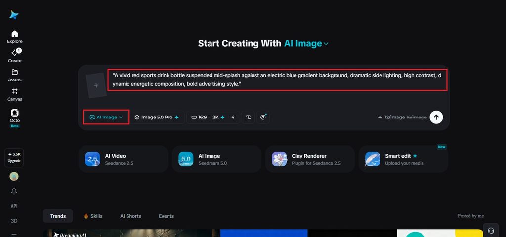
Choose Image 5.0 Pro by Seedream 5.0 Pro as your model. Set your aspect ratio and size based on where this concept will actually run, then pick resolution, 1K to test whether the bold direction is working, 2K once you're confident it's the one. Click Dreamina's icon once it's set, and let it generate.
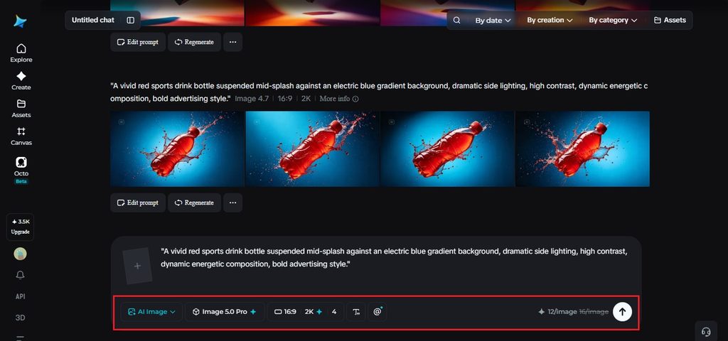
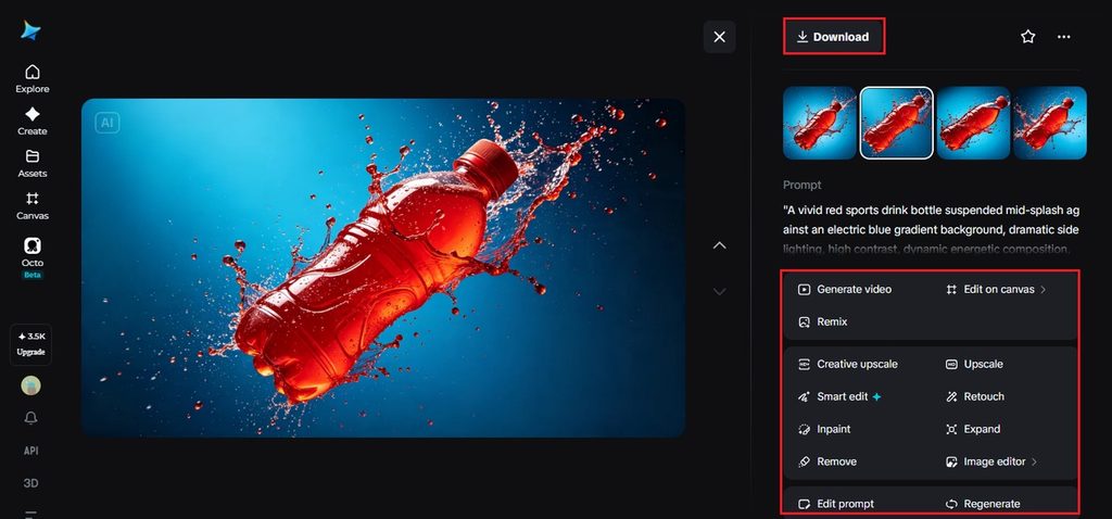
A high-impact concept rarely lands perfectly on the first attempt, since pushing boundaries means more can go slightly off. Use inpaint, expand, remove, and retouch to sharpen contrast, adjust a color that needs more punch, or fix a detail that's pulling focus away from the main subject. Once it hits the way you want, hit "Download."
Attention-grabbing doesn't mean abandoning what makes a brand recognizable. A few habits keep bold concepts from drifting off-brand entirely:
This keeps the boldness intentional rather than random.
A handful of habits tend to work against this kind of visual specifically. Playing it safe out of caution defeats the entire purpose of the exercise, since a concept designed to blend in was never going to earn the attention it needed. Overcomplicating a composition with too many competing elements causes a similar problem, since a viewer's eye has nowhere clear to land. And chasing boldness for its own sake, without any real connection to the product or brand, usually just produces something memorable for the wrong reasons entirely.

This approach earns its place in a specific set of situations. Product launches benefit enormously, since a first impression only gets one real shot at cutting through the noise. Social-first campaigns follow a similar pattern, competing directly against an endless scroll of other content fighting for the same few seconds of attention. And rebrands or repositioning efforts get real value here too, using a visual break from the old identity to signal that something has genuinely changed.
An attention-grabbing concept was never about being loud for its own sake, it's about being specific enough that nobody mistakes it for something else in the feed. With Dreamina and Seedream 5.0 Pro, testing that kind of bold, distinct direction costs a fraction of what it used to, making it far easier to actually take the risk that gets noticed.
Read Next: How to buy Tron (TRX) for US dollars (USD)