Last updated on : November 3rd, 2022 by R Yadav
For the purpose of representing images in computer graphics, vector graphics use geometrical primitives like points, lines, curves, and forms that are all based on mathematical formulas. Vectors serve as the foundation for vector graphics, and they pass through areas known as control points. Each of these points defines a specific location on the x and y axes of the work plane and establishes the path's orientation. Unlike pixel-based images, vector graphics may be amplified indefinitely without losing quality.
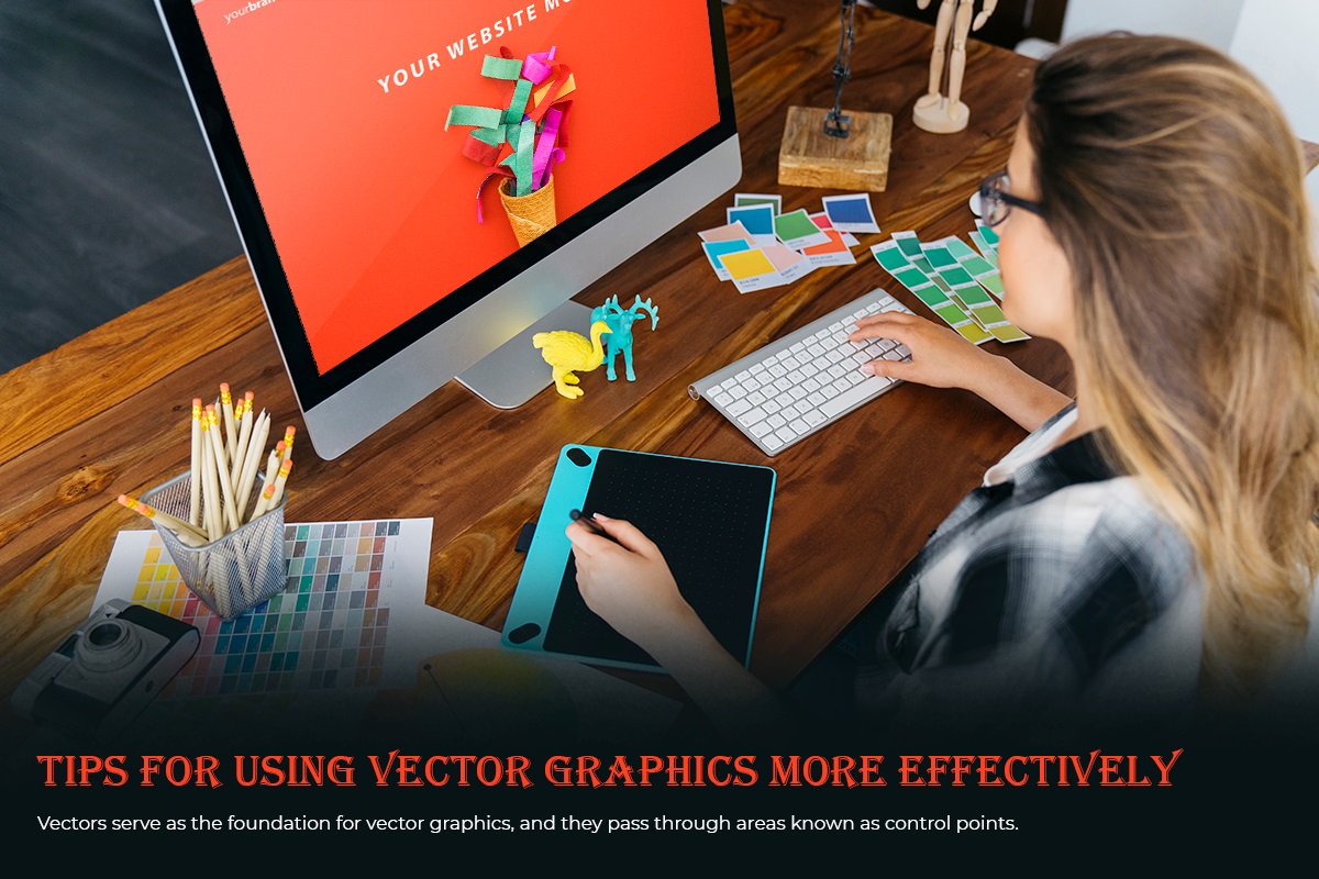
An example of creative output is a vector illustration. It's incredibly fun to play with colors once you've mastered the fundamentals. To get you started creating vector graphics using Adobe Illustrator, this article will provide you with the first few tips and advice you'll need.
In this article, I'll bring you through 10 tips that will introduce you to the foundations, including crucial tools, and get you started on the path to transforming your creative ideas into stunning vector graphics.
To create vector graphics, free vector icons and images, you'll need an Artboard when you initially launch Illustrator; this is the document or space you work in. Click File>New and enter the size you want for your image; if the size isn't important when you're learning, select A4 from the drop-down selection. In the Advanced section, you may also select CMYK for print or RGB for online if you're drawing for print.
It's better to develop the practice of keeping your work as you go while you work. To name your file and specify where on your computer to save it, first select File>Save As. Then, if you want to save the file exactly as it is, just select File>Save or press the shortcut key Ctrl+S. To ensure that nothing is ever lost in the event of a computer disaster, I advise developing the practice of saving in this manner every minute. You may continue this procedure to save other, more current editions of the artwork as different files.
If you wish to approach a topic, think about breaking it down into its fundamental components. Base forms are shapes that symbolize the core components of a design. They're wonderful for designing since you can judge the entire composition well just by looking at these flat forms of color.
You can never predict when a feature like this would be useful. I've incorporated it multiple times into website backgrounds or logos. With this, as with other things, moderation is key. You must first build a form before selecting Scribble under Effect>Stylize. You have the choice of selecting alternatives like Childlike, Snarl, Sketch, or Zig-Zag. With complete control over the quantity, line choices, spacing, and angles, you can produce some really fascinating compositions.
It's wonderful to have the color guide. When you want several colors and tones of a color, it might save you a lot of time. It also offers additional color choices that are complementary to the one you've chosen. Simply pick a color, check that your color guide is open, and then experiment with other hues with ease.
Repeating components may be seen in many situations and items. You will speed up your process if you can recognize them. If you want a realistic appearance, learn how to duplicate pieces and then alter them to make them look different. Nothing is more annoying than a realistic render with components that are exact replicas. Copying and pasting are OK if you're working with something much simpler.
Brushes can function similarly to repeated components. Consider that it would be simpler to turn a basic object into a brush if you can spot one that is being used repeatedly. I adore brushes, and I enjoy discovering new methods to use them to enhance images or even stand in for the main subject altogether.
Although being a straightforward subject, it might save you a lot of extra time if you don't know about it. You've written a paragraph in the ideal font and size, and you need four more headlines to match it. Using the eyedropper to choose the font will replicate its properties to your existing text rather than requiring you to manually enter the font size and name.
Always keep the overall aesthetic of your artwork in mind when creating new elements. The illustration will start to lack authority if there are too many abrupt changes in style and design. No matter how little, try to include your style in every vector element you use; this will help retain the coherence of your work.
Avoid using the Auto Trace tool in Illustrator or trace shapes in your design, despite the fact that they could seem like a convenient alternative since the results almost always come across as clumsy and unprofessional. Regardless of how thoroughly the tracing was done, I believe this rule is still valid.
I hope that this post has helped you understand vectors and how to use vector graphics. Making caricatures of any piece of art is an art form. Therefore, you need carefully consider each aspect in order to create unique and captivating vector art. As a skilled vector artist, Clipping Path Experts offers raster-to-vector conversion, Photoshop clipping path services, and affordable picture editing.
Read Also: Emberify: Potential Tips To Use Instagram For Brands